Artwork guidelines
Contents
GCompris Artwork Guidelines
Here are the guidelines to follow when creating new artwork or converting old artwork for Gcompris.
01 - Simple style
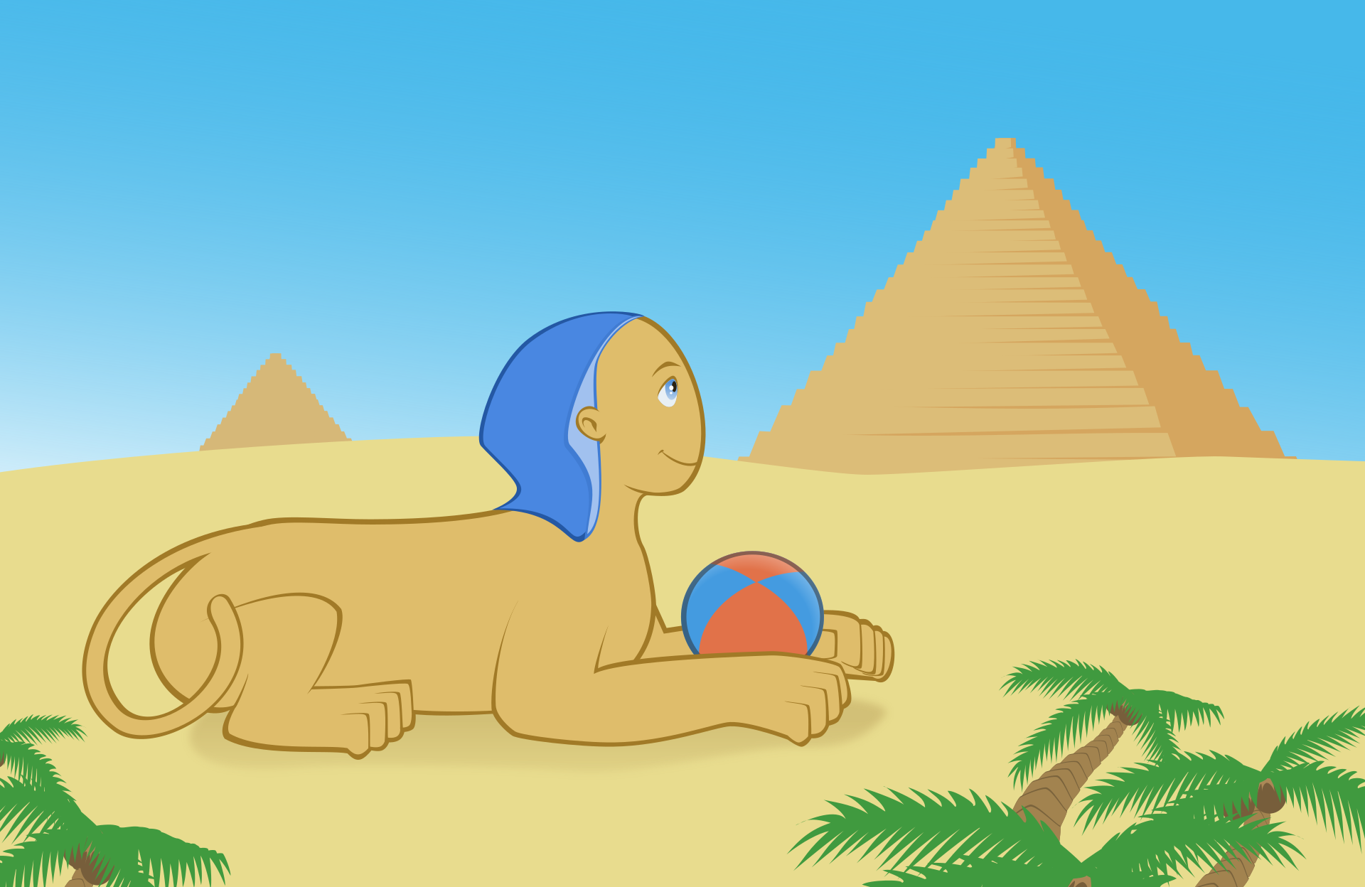
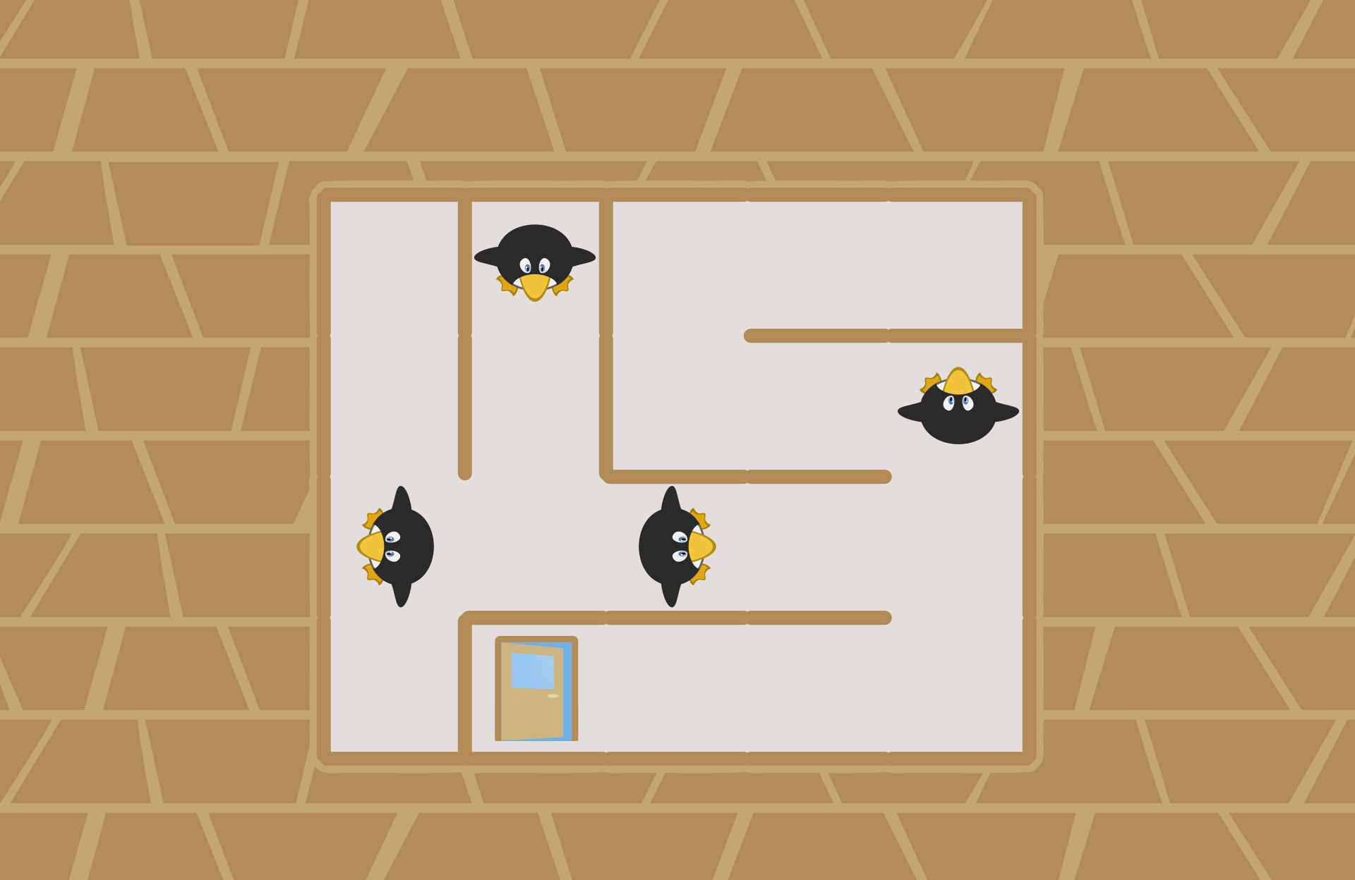
Simplify shapes to try to reach a mix of cartoon and anime style. Make things cute.
02 - Internal lines
To add internal lines (like a nose on a front face, or if two shapes of the same color are crossing), use the surface color and darken it enough to get some contrast but don't make it black (unless really needed by the activity). For some reference values, reduce the lightness around 100 and remove around 20 of saturation. Also don't use linear-width outlines, use shapes instead to make nice dynamic-width lines with sharp ends.
03 - Outlines
Don't add outlines on the scenery. Only add outlines on characters and important objects. Outlines must be wider than internal lines but colored the same way. To draw outlines, copy the shape, apply the outline color to it and paste the original fill object over. Then reduce the object using a combination of centered-scaling and manual points edit to get a nice outline with small width variations. This way you can keep as much as possible the original shape silhouette without fattening it with the outline. It's important to keep the same set of points as the original shape (so don't use shrink path feature as it makes a new set of points..). For special cases of complicated nested shapes construction (like the balloons in the examples), it is allowed to add an outline over with a dark gray and 50% alpha color.
04 - Flat colors for hard objects
Use flat colors on every "hard" surface, no gradient. Only use gradient for transparency effects (like the sky, some water, eyes...) or similar special effects. For the eyes, follow the examples: no outline, almost white, top-down gradient for the iris, almost-black pupil, two white reflections (with possibly small transparency).
05 - No shadows
Don't add shadows most of the time, to make things more shiny. Only to suggest something is really big, you may add a blurred colored shadow area on the floor.
06 - Soft colors
Things must be very colored, but use more pastel or at least not too saturated colors (unless really needed by the activity).
07 - SVG format
All artwork must be pure vector svg files, no raster files. Also we can only support the SVG Tiny 1.2 subset of features.


